Logomark Selection
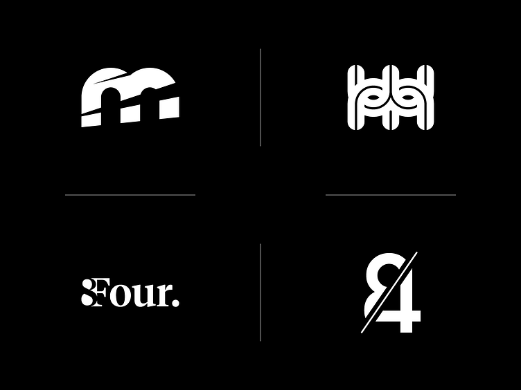
A brief selection of logomark variations I've developed in the past for my brother's various endeavours.
The latest is Motorsport Maker, represented by the top two logo variants. The chosen logo was the one on the left, representing the ferocity and speed of motorsport. The complete strikethrough splits the letterform into two parts, helping form the initials "MM".
The logo on the right was ditched. It's a more literal interpretation of the letters, and is meant to imitate the intricacies of an engine and/or an exhaust manifold – it's open to interpretation. I preferred it until I started seeing a mask!
More by James Peacock View profile
Like
