DailyUI :: 004
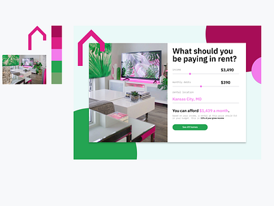
#004: Design a calculator. Standard, scientific, or specialty calculator for something such as a mortgage? Is it for a phone, a tablet, a web app?
Process: If you look at yesterdays challenge you'll see the exact same logo. I shamelessly reused, my intention for the design yesterday was an apartment building or a school. I switched directions mid-way to something of a fashion magazine, so I felt that I could reuse this again today.
I pushed the idea of a calculator to a rent calculator. I just saw a ton of boring calculator UIs all over dribbble and wanted to be different. I don't think I have ever used a pale pink, hot pink and kelly green as a color palette. I really am loving that this challenge pushes my design choices. As I built this, the design started to remind me of Spotify's style, which is one of my favorite UI treatments.
Day 4 of 100...what did I sign up for again?

