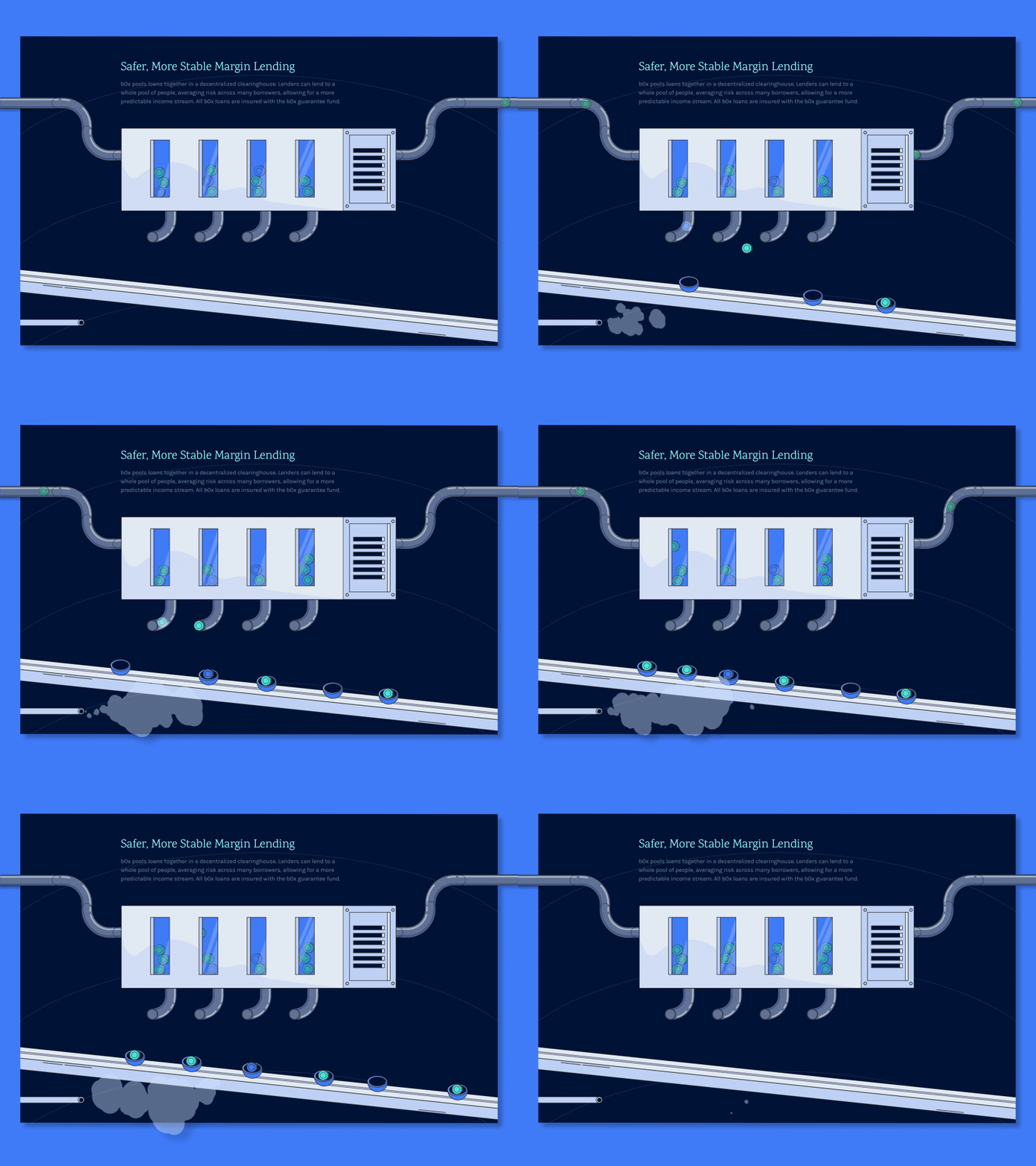
A New Website for FinTech Startup: Feature Section
Hey there!
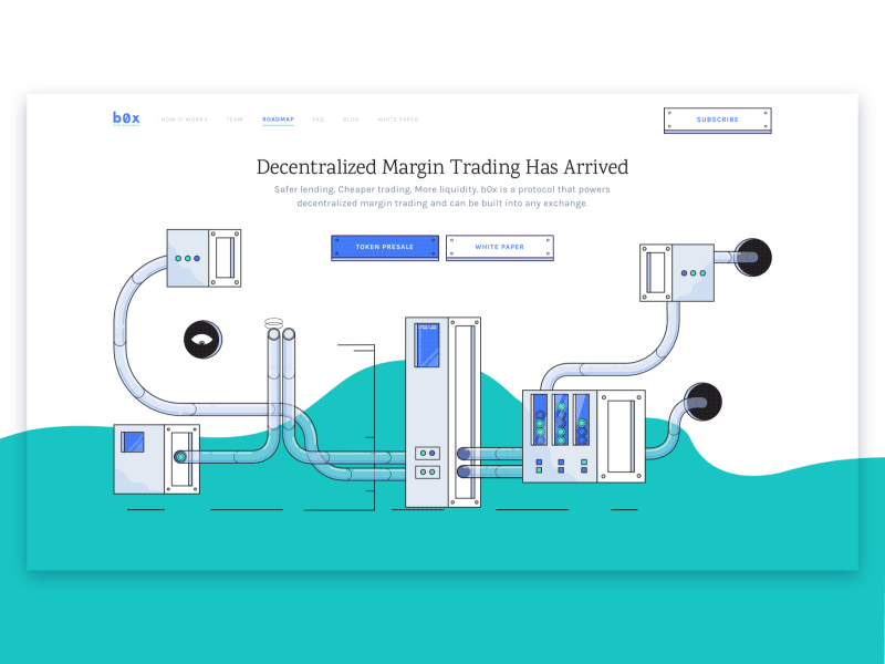
This is a feature section of the website we designed and built for bZx, a startup that specializes in decentralized margin trading. The website has finally gone live! And now it’s nominated on FWA and CSSDA!
Creating illustrations for the website was a very interesting experience for me as it was the first time the illustration I made was large enough that it actually became the site! See for yourself: https://bzx.network/
Let’s learn a bit more about bZx:
bZx is a startup that specializes in decentralized margin trading. The key element here is a protocol developed by the guys that powers decentralized margin trading and can be built into any exchange. Basically, that’s a technology that allows safer lending, cheaper trading and more liquidity.
We got pretty excited here at Zajno when guys at bZx got in touch to ask us to design and build a website for them, and here’s why:
Goals
As bZx is a business that takes some pretty complex financial instruments, and makes them more accessible, their website was to play a key role in helping to break down the barriers to understanding their product. Besides, bZx didn’t just want a nice storytelling, illustrative website, they also wanted a significant dose of wow-factor. And that’s what sparked our interest!
Approach
Having done the research and prototyping, we started experimenting with the design, trying out different solutions until we came up with the one that met all the requirements. As soon as the designs were ready, the development stage began which was even more challenging. We set ourselves the goal of completely shutting the door on ‘low-quality content’. That meant no GIFs and no PNGs, only SVG and programmed animations. We also tried applying fluid-responsive layout for the first time, and we’ve got to say we’re fascinated with the result.
Result
As a result, we ended up with a truly storytelling website, united by a single theme, telling a compelling visual story using animation. Besides, the website is pretty original and from what we heard it does create wow-effect :) It also has good performance: ~95/100 according to Chrome Developer Tools and Lighthouse. And the last, but not the least, this project taught us a bunch new things and sharpened skills we already had, which is always cool!
There are many more interesting things to tell about this project, and we’ll do it in our new Medium article which is coming really soon! Stay tuned! Share your feedback! And support us on CSS and FWA awards platforms! Hugs :)
Press "L" to show some love!
ᗈ Join our Newsletter!
ᗈ Website
ᗈ TheGrid
ᗈ Spotify
ᗈ Twitter
ᗈ Medium
ᗈ Facebook
ᗈ Instagram

