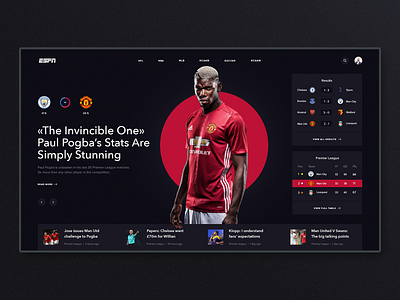
ESPN. UI redesign concept
Have you ever noticed that many great and well-known websites have so outdated design? We, UX ENERGY, decided to suggest the ideas of how some of these websites would look in 2019.
🔥 You can check the full behance case here: https://www.behance.net/gallery/70036407/Famous-Brands-UI-Redesign-Interactions
Today I want to show you an ESPN redesign concept!
We’ve spent a lot of time on ESPN concept creation. As the website is challenged, with a lot of information blocks, so we had to prioritise the most important information for user. After that we built the hierarchy and then we proceeded with UI design. We are pleased with the result and we think it became better.
More by Nick Zaitsev View profile
Like
