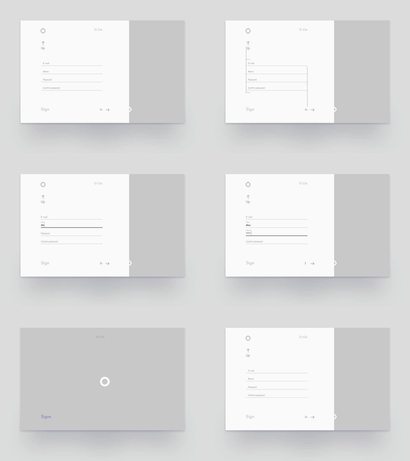
Sign In
Minimalistic UI solution - one page for both Sign in and Sign up, depends on which fields the user will fill. Just linguistic fun, visualizing button like arrows up↑ in→. This decision is fit to mystery project "O clo"
If you like it - press "L" and have a nice day 😌
More by Olga Votchenko View profile
Like
