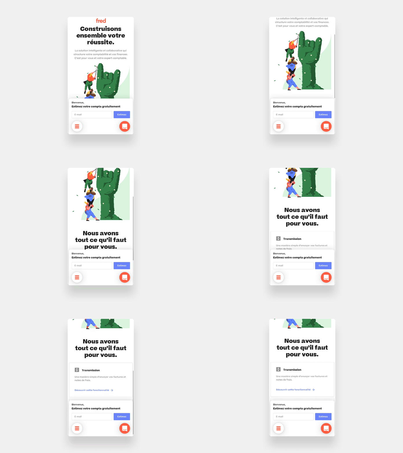
Mobile footer exploration
Here’s our home mobile website I did few months ago for our website redesign.
I try to solve 3 problems :
- First, put menu action to the bottom of screen. Mobile screen become really big. It becomes a pain to have this action at the top of the screen.
- Allow us to have more lead with a test of displaying input with a fixed position.
- Combine all these elements with the Intercom components
Here is the result,
- After some analyse the input hide the contents of the page too much so we abandoned the idea.
We keep the rest of the exploration, the website release next week. Some new post coming soon...
--
🧡
More by Mahedine Yahia View profile
Like
