Up App Transitions
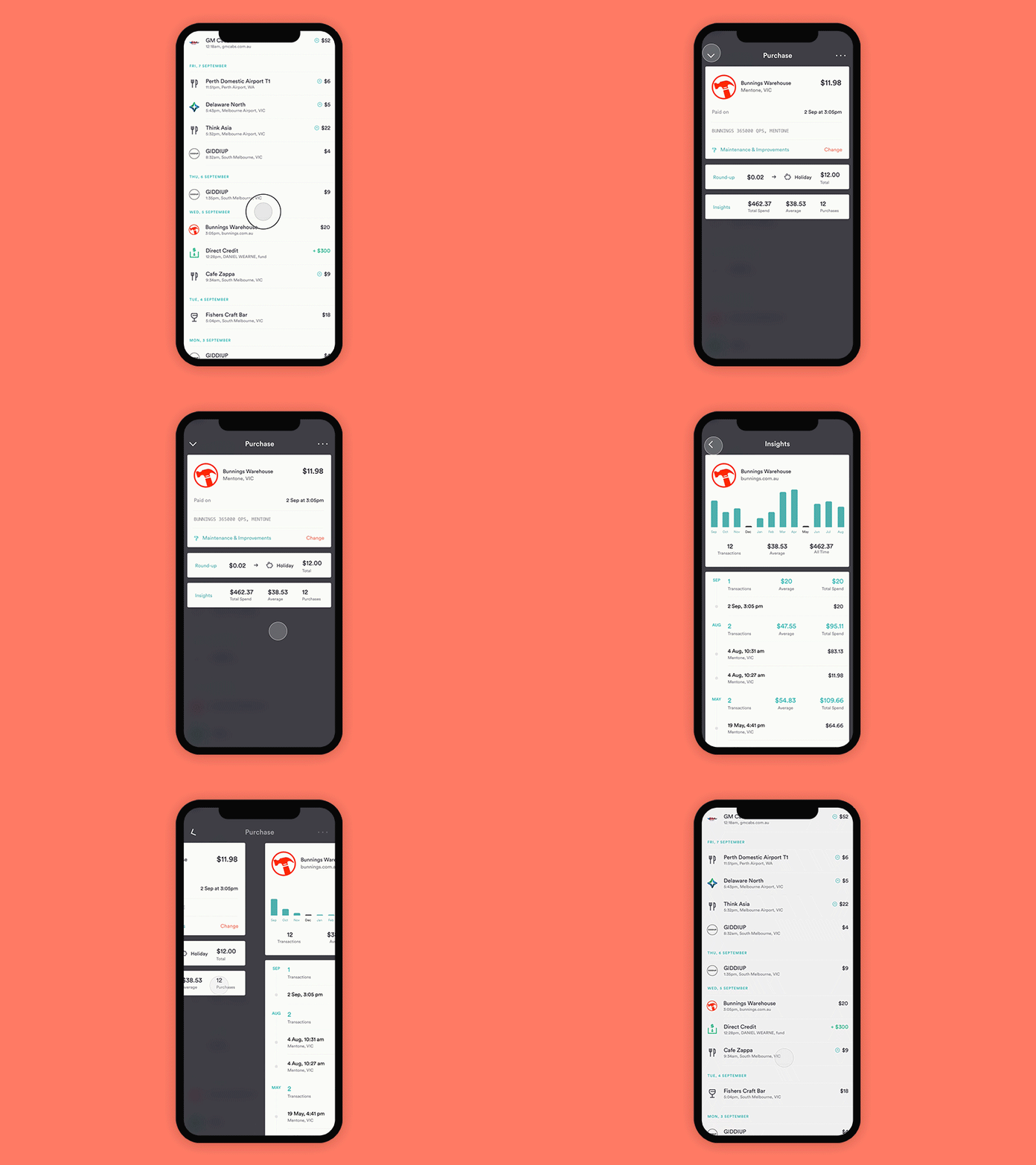
Here's a prototype made in Principle showing our thinking for a very common and atomic interaction in the app, viewing a transaction. It's a flow we'd like to feel quick and smooth. We were a little unsatisfied with some of the default transitions in react navigation, and over time thought that we could build a bespoke drawer to fit our needs. It would move in from the bottom of the screen, and then left/right once navigating within the drawer.
One of the challenges we face by not having a tab-nav at the bottom of our app was the lack of an 'escape hatch' or a way to reset to where you came from. We used a standard close 'X' in the top right corner, but @Levi Buzolic had a clever idea of reusing the back arrow by rotating it, and also afford the ability to 'pull to dismiss' from any modal. This freed up the top right for an ellipsis item (when needed) and once learned, is a much easier interaction for the user to dismiss the drawer than reaching with your thumb to the top corner.
Next bit of thinking will be considering loading states.
Check out the attached video to see the flow in 50 fps 😆
