Sign Up - 001 #dailyui
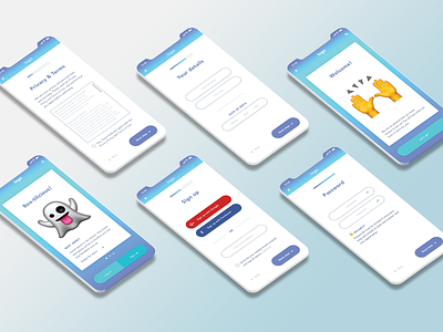
The first #DailyUI challenge is a sign-up form. I wanted to design a sign-up that would take the form of an on-boarding process, rather than a single one-page form. The information shown to the user needs to be simple and less overwhelming, and must be GDPR compliant. This is for an imaginary app!
Problems to be solved:
- Must be GDPR compliant
- Must work work well on mobile devices
- Must be quick and intuitive to complete
Design thinking
- Short introduction reminding users why they should sign up.
- Privacy Policy & T&Cs acceptance is right up front, in accordance with GDPR laws. I have put the policies on-page so that the user can read them easily without having to click away.
- Providing social media log-ins to sign up is a simple way for people to sign up in a frictionless way (especially on mobile devices).
- Showing the sliding progress bar allows users to see how far along they are in the process.
- Email sign-up is optional and unticked, which matches GDPR laws.
- Keeping the ’Next Step’ button in the same place for consistency, as well as providing a ‘Back’ button if they make a mistake.
- I tried to design everything so that it is easy to click or slide-through the process, using your thumbs.
- The first and last screens are splash screens, fully branded including the (fake) logo. The logo fades out on the screens in between to help focus visual attention on the sign up process.
- The ‘reveal password’ eye icon gives users the option to check the spelling of their password before finalising it.


