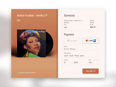
Checkout - 002 #dailyui
Trying out this Daily UI thing... this is actually 002 Checkout, not 001 (I will upload that tomorrow!)
-----
I am the queen of reaching a credit card payment screen and crashing out of the process, without ever purchasing the thing I wanted to buy. It takes very little for me to pause and remember that I don’t actually need to buy this thing. Good for my bank account, bad for online shopping merchants who nearly had my money.
So I wanted to design a checkout card that was super simple, intuitive and required zero complex thinking! I personally love having the option of Paypal because I don’t need to dig my wallet out of my bag.
Design thinking
- Implemented a simple way to checkout using either Paypal or Card
- Provided a breakdown of the cart including tax, so you can see exactly what you are buying
- Simple way to edit your card, or to close the card and go back to the store
- Provided simple explanations of what terms such as CVV mean (in human speak)
- Tried to keep it clean and minimal
- Colours reflect the artwork - you could recreate this on a live project using something like Vibrant.js https://jariz.github.io/vibrant.js

