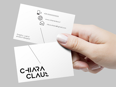
Designer logo & bdv
This logo had to represent one of my main attitudes: synthesis. In my projects I love, in fact, to look for cleanliness and essentiality. This reasoning led me to choose a clean and geometric font like Geometos and then, through various graphic cuts, find the extreme synthesis of my logo (without precluding its readability). The triangle was another guiding element of the project, as it is also a symbol of synthesis.
See the complete project:
Behance → https://www.behance.net/gallery/69849553/Personal-Brand-A-Designer-Corporate-identity
Site → http://www.chiaraclaus.it/
More by Chiara Claus View profile
Like
