New Homepage for Cutting Edge Knives - Iteration 1

Been a long time but we're finally getting around to rebuilding Cutting Edge Knives and giving it a long overdue upgrade as it's been largely running untouched (we've done some minor tweaks but not much!) since we built it in 2011.
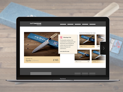
The current homepage for us has been a real positive piece of design in terms of setting us apart from our competitors and giving our customers a bit of a fun experience but it's not without its frustrations - it's hard to maintain image quality (each knife must be professionally photographed otherwise it looks crap), on desktop we rely on the user to hover over each item to see prices and product info and there's a limit to the number of knives that sensibly fit onto a smaller "desktop" screen in the current rack format.
With this version I'm addressing the photo issue and giving us more flexibility to play around with grids but retaining the overall sliding UI which we know has tested well over the years but needed that bit of flexibility.
I'd love to hear your thoughts on this and the iteration 2 of this slider as we move forward with our rebuild 👍
Is there anything else obvious our current website is missing on the homepage carousel that I should look to improve?
Hope you Like it!