Conference Travel
Hi guys!
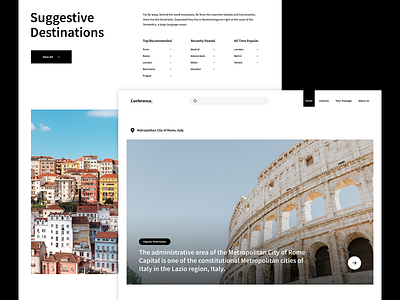
An exploration layout for a travel agency website. Client wants something very clean and playing with white space design. This is one of the version I've came out with. I called it BASIC, using b&w for the typography and elements in order to let the destination pictures stand out.
More screens coming soon! :)
More by Four Fries View profile
Like

