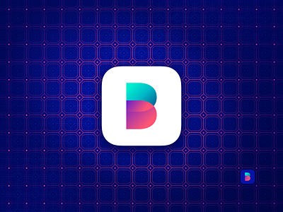
Balance App Icon
Hey friends! Here is the app icon of the Balance app. Creating it my idea was to achieve the simple logo that has equal elements. That’s why you can see intersecting 2 parts in the middle.
The colors represent 2 contrast meanings—income and expense.
Haven’t decided which background is better—dark blue following the whole style of the app or white to make it stand out more.
How do you find it?
Check the full case study on Balance App on Medium
More by Liudmyla Shevchenko 🇺🇦 View profile
Like

