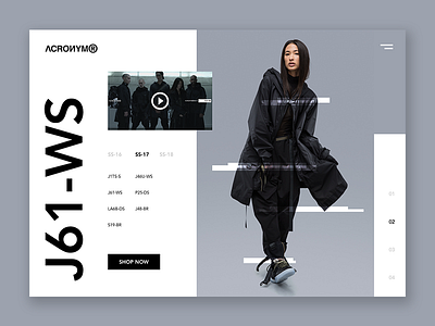
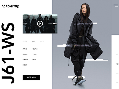
ACRONYM® - Visual Exploration
Some visual exploration for ACRONYM®, as I really love the brand's monochromatic and modern aesthetic. Too bad I'll never be able to afford their pieces, ahaha.
The goal of this design is to have the product speak for itself visually and allow users to easily browse through new and past products organized by "Season Collections" (even though ACRNM's products are limited releases)
All photos are the property of ACRONYM® GmbH
More by Quincy Ho View profile
Like

