⬆️ ⬇️
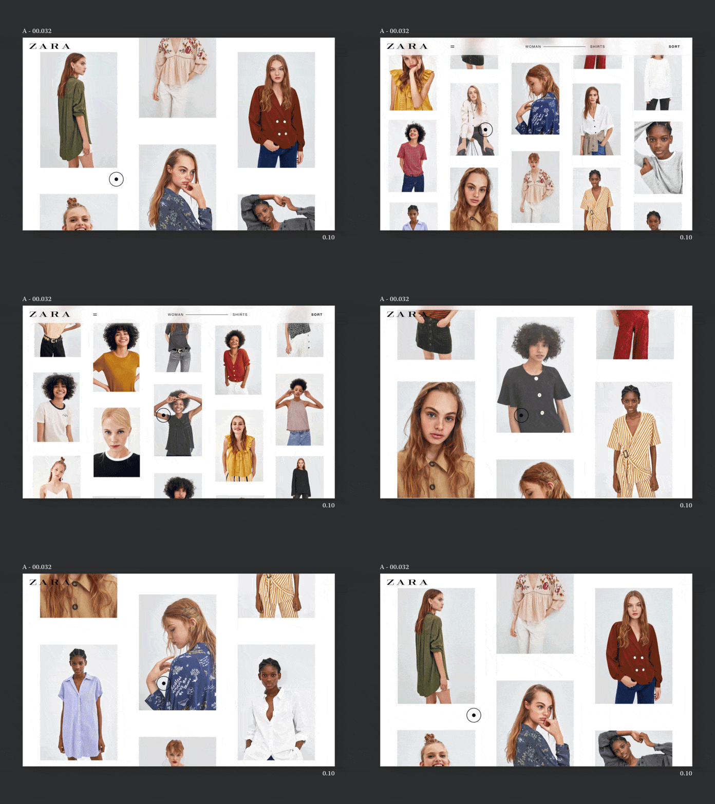
Flexible grid aware of scroll direction.
Concept: Scrolling up lets the user come back to whatever caught the eye quicker, by showing more products. Scrolling down narrows the view, brings focus to a few products when the user is exploring them.
It's all as simple and natural as stepping back to get a wider perspective and looking closer to see more details.
I already see 82 ways to improve the functionality of this concept, so treat it as a little teaser.
I've been designing some fresh e-commerce interactions recently. More is on the way! 👽
Check out what the rest of my team is up to: → GC Team Page
More by Unseen Studio® View profile
Like
