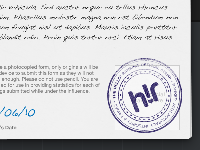
Stamp of Authenticity
There's something my designs have always seemed to lack—life and texture. Always on with the rectangles with some highlights and such. Always on with the text in a line set in Helvetica and nothing at an angle. I have to keep on my toes in this place, it's epically intimidating to be here now. :P
Behold! It's a stamp on a rebound of the ranking form.
I kept thinking of how members will be "submitting their rankings." So why not actually give them a form! This is nothing new in the grand scheme of things—I've been inspired by many a designer here on Dribbble when it came to this style—but it's a damn accomplishment for me to see it on something I made.
Things will change in practice, like that handwriting font, I'll need one that's a bit more legible.

