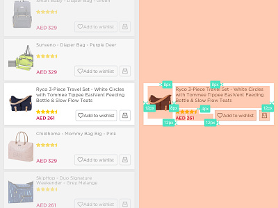
Product list view card design
This case is when you wanted "Add to wishlist" button to be the primary action for users to take. Normally It's only a little heart icon on the top right corner.
What do you think about this card design? and If there's any space for improvement.
More by Molham Bakir View profile
Like

