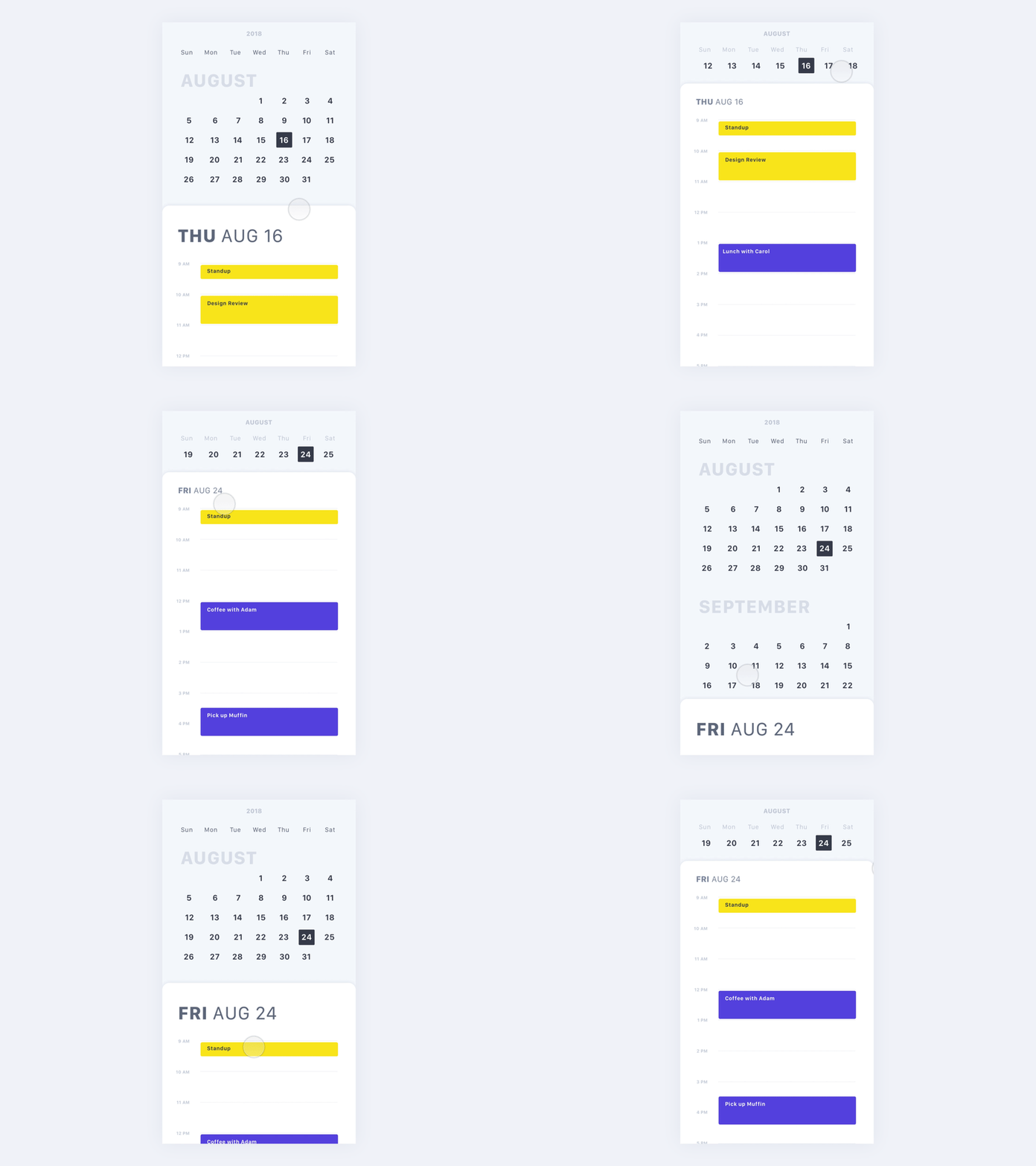
Calendar - Slide Up (Part 1)
Split views with slide ups! I’ve been obsessed with slide ups for a while now. They’re super versatile, allowing the user to see more information or perform more actions WITHOUT losing context to where they are in the app. And these are conveniently located by the thumbs!
We’ve been seeing more and more of these slide ups. But before recently, information or actions in slide ups would be in pop ups or on different pages, which just didn’t flow as well. Modals were never really welcomed, and different pages can cause more context switching. Both were just a bit intrusive to the user flow.
I’m a huge fan of these slide ups and definitely want to see more of these!
More by Vivian Zhang View profile
Like
