Daily UI - Day 002
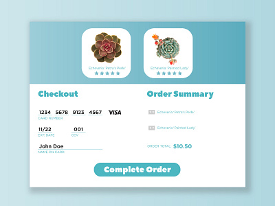
Day 2 of the Daily UI Challenge. The goal was to create a credit card form for an online store. I wanted something clean and to the point. A lot of other checkout forms featured large images of the product the consumer was buying. I thought this was unnecessary. White space and readability is more important than a large visual meant just to take up space. I think the top space could use some more work on this design, but overall I'm happy with this.
