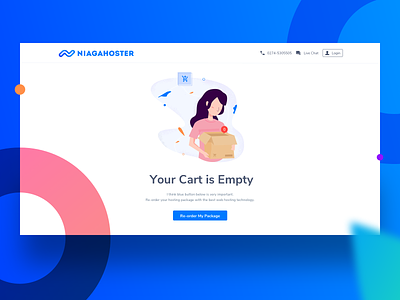
UI/UX Challenge Empty Cart
UI/UX Challenge. Emptystate - Empty Cart for Niagahoster website Web hosting service.
Case Study:
========================
An empty state or zero data state is an afterthought for many designers. Because it’s a temporary or minor part of the user experience. As far I concern in UX design these are commonly known as first use, user cleared and errors. In this time I try to experiment with errors empty state, how to optimize the empty state to provide a pleasant experience for users?
Give an information when users did something wrong on the cart. Sometimes visitors website will have experience with an empty state as part of an error. Most commonly due to lack of internet connection and missing page url. This is an opportunity to make them aware to enggage and give an information and direct the visitor to re-order or re-select their package.
Ssstttt...the girl in this picture was inspired by Nancy momoland.
Constructive feedback are welcome, and don't forget to press L on your keyboard.


