MAAC - Identity
Branding guidelines for MAAC
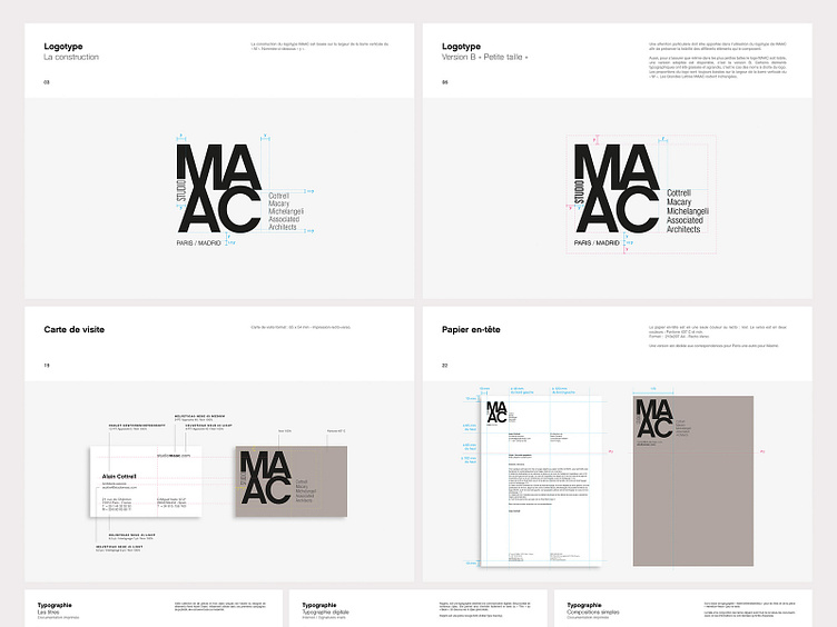
My mission was to create a strong identity, in which each of the architects could meet. In order to embody this new identity and not lose the legacy of the old structures, the names of the associates were attached to the logo. The latter is however thought to live without. MAAC being present in France and Spain, I imagined two possible forms of the logo. For its use in Spain the word "Madrid" is in bold and Paris in light. The opposite for use in France. The international version gives as much importance to the two cities. The complexity of the logo, with its different levels of reading, involved a version adapted for use in small sizes, a kind of responsive design applied to the logotype.
------- Ma mission était de créer une identité forte, dans laquelle chacun des architectes pourrait se retrouver. Afin d’incarner cette nouvelle identité et ne pas perdre l’héritage des anciennes structures, les noms des associés ont été accolés au logo. Ce dernier est toutefois pensé pour vivre sans. MAAC étant présent en France et en Espagne, j’ai imaginé deux formes possibles du logo. Pour son utilisation en Espagne le mot « Madrid » est en bold et Paris en light. L’inverse pour une utilisation en France. La version internationale donnant autant d’importance aux deux villes. La complexité du logo, avec ses différents niveaux de lecture, a impliqué une version adaptée pour une utilisation dans de petites tailles, une sorte de responsive design appliqué au logotype.
