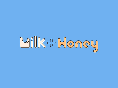
Milk + Honey Horizontal Wordmark
The horizontal wordmark designed for Milk + Honey. Constructing the logo with circles leads the eye as it flows through the shapes, which reinforces the bakery's name and the fluid concept of the brand.
Check out the project on Bēhance!
More by Adam Womble View profile
Like


