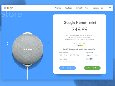
Google Home Product Page.
Turns out I had a lot wrong with the previous version of this...
Even If I wanted to do black and white, I didn't pay much attention to contrast and clarity.
The fact that it looked comprehensible on my screen doesn’t mean it would be so on other displays.
Lesson : Design is about usability, for “users”, don’t design for your eyes only.
Well, the difference speaks a lot.
Now tell me what you think. ;-D