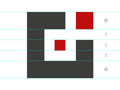
Doublethink Logo
Our new logo, this is a part of our recent studio rebranding. As the annotations show, the size of the outer width is the width of the inner measurements multiplied by the golden ratio.
The whitespace is is a ligature of a lowercase "d" and "t" with the two red squares referring to our previous logo which was simply two "thought bubbles" in a logotype.
Like
