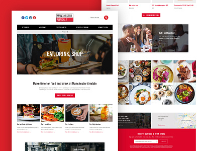
Manchester Arndale landing page
I've recently completed a short project re-designing the Food &; drink landing experience on Manchester Arndale's website.
Food & Drink has long been a key ingredient (coughs) to increase dwell time and maximise retail spend in shopping malls.
Many malls in the UK have been slow to keep up with consumers' changing tastes and meet the needs of the Instagram generation. Arndale is changing, bringing in bigger names, offering a wider range, and better venues.
The objective of this redesign was to showcase the full offering, appealing to focused audiences; families at weekends, university students, and local workers nipping in at lunch.
The meat of the redesign was to be more visual, show the amazing food on offer with lip-smacking photography, after all—the first bite is with the eyes!
We created a huge header image that Ken Burns' its way through images of people enjoying the different venues on offer.
We made the A-Z search more obvious for task-focused users.
In order to match our users intent, we suggested a system that would dynamically update collections of curated outlets with content that was specific to the time of day and focused on families at weekends.
We set up a guest food blogger feed (cough)
We established a format for curated Instagram images showcasing some sexy looking food.
We highlighted food and drink promotions for price-conscious students and created the ability to sign up for updates specifically about food & drink.
This is an overview shot, I'll post a few more of the details explaining specific elements and their thinking shortly.
Brand identity already set. We reappropriated a lot of components to reduce cost.


