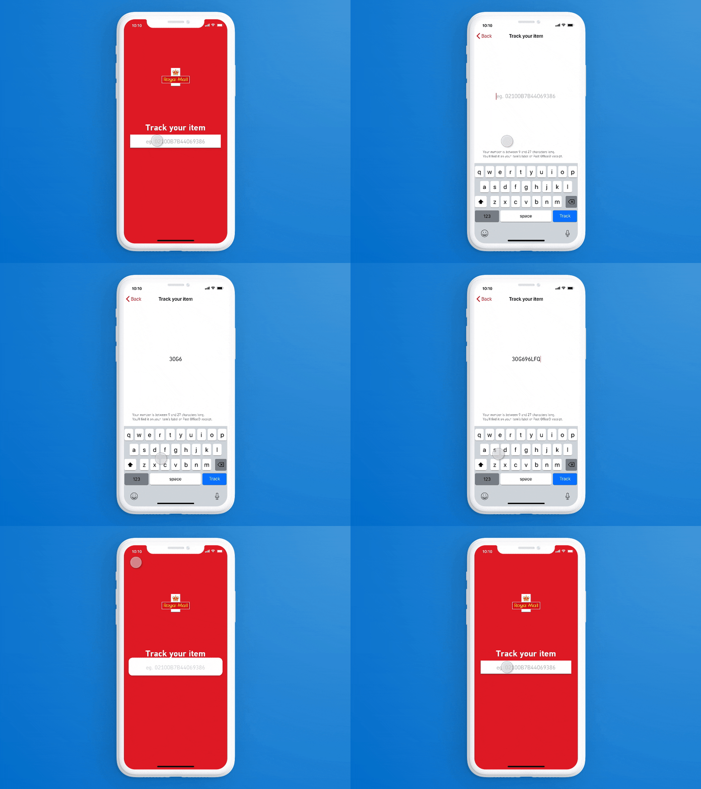
Form Field Experiment
While I was working on the design for a new Royal Mail app I experimented with simplifying a single field input.
I wanted to embrace the full screen experience of the then recently released iPhone X and make the field at hand the sole focus.
Small scale user testing delivered mixed results - half the users got it, and the other half thought they had gone to a new page.
I concluded it wasn't the right approach for this particular project but the concept does have potential in the right situation. Once the field opens up there's space for information such as hints or past searches (which could be scrollable).
More by Mark Hanney View profile
Like
