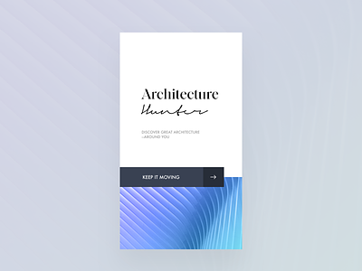
Architecture Hunter Mobile App
Opening screen for the architecture hunter app. Working on white space and mixing different typefaces. Tried to keep it minimal and slick.
What do you think? Did I succeed?
—
I experiment with grids, typography, hierarchy, colour, and white-space. I post every Monday, Wednesday, Thursday.
—
🖤 Hit ‘L’ if you like what you see
💬 Tell me how can I visually improve this
📎 Check out the attachment for full-size
🕶 Follow my profile to keep up with the Journey
—
Thanks for viewing!
—
Instagram / Website
More by Imran Ashraf View profile
Like

