yü2
Very early stages of a thing.
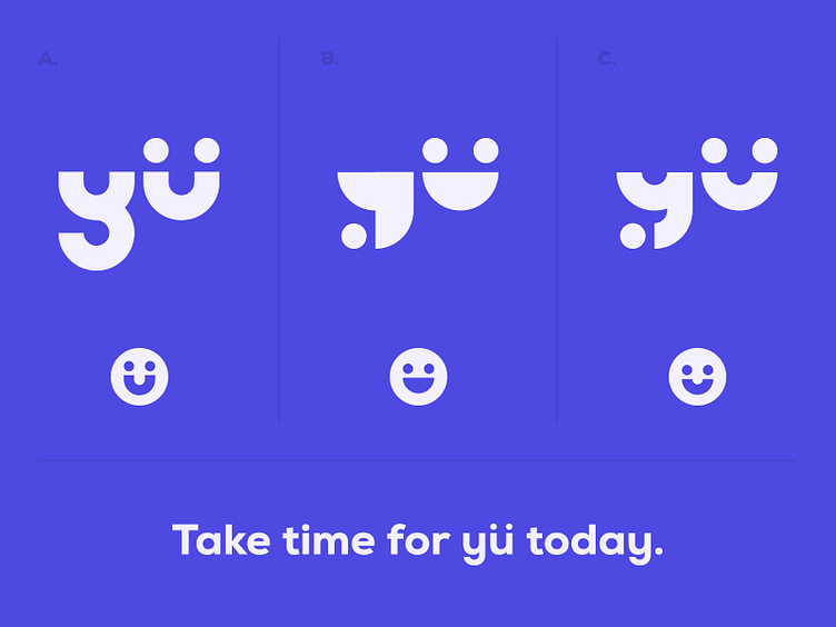
Some people mentioned that my previous attempt shared similarities with the Jet.com logo, so here, I'm trying out a few options and a revised color that hopefully help distance this a bit more from Jet.
FWIW Jet's color is straight up purple, while this color here is more of a periwinkle color. More blue than purple.
Anyway, I'm going for uniqueness in the letterforms, and I'm hoping that the umlaut-U calls to mind an image of both a smiley face and also two connected people.
Which of these are your faves and why? How's legibility?
More by atomicvibe design lab View profile
Like

