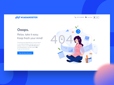
Empty State - Error Page 404
UI/UX Challenge. Emptystate - Error page for Niagahoster website Web hosting service.
Case Study:
========================
An empty state or zero data state is an afterthought for many designers. Because it’s a temporary or minor part of the user experience. As far I concern in UX design these are commonly known as first use, user cleared and errors. In this time I try to experiment with errors empty state, how to optimize the empty state to provide a pleasant experience for users?
Sometimes visitors website will have experience an empty state as part of an error. Most commonly due to lack of internet connection and missing page url. This is an oppurtunity to make them aware to engage and give an pleasant experience for them by giving them an extra discount regarding to this case.
Constructive feedback are welcome, and don't forget to press L on your keyboard.


