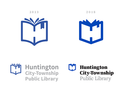
2018 touch-up
Our brand was looking fairly dated. I updated the logo to better reflect how it'll be used (mostly digital), the current spirit of our library, and the direction it's headed — all while keeping the same spirit and concept. We've got a big renovation starting soon, so the colors got a bit of a tweak to match as well.
More by Devon Henderson View profile
Like
