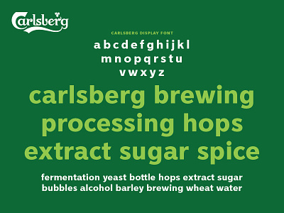
Carlsberg Rebrand – Lower Case Specimen
Taxi Studio has collaborated with Carlsberg on a major global rebrand, unifying its diverse markets with a simple yet versatile identity system that champions the principles of great Danish design.
I worked with the team to craft core elements that include the logo, hop leaf, crown and brand typeface, as well as the signature of Carlsberg founder JC Jacobsen.
Here is a closer look at the upper case brand typeface I designed.
The angle that forms the sharp terminal on the 'C' of Carlsberg has been introduced to the appropriate letters to help tie the two aspects of the brand together.
More by Tom Lane View profile
Like
