BoT Automation Shopping Flow
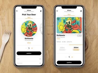
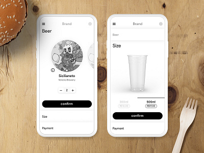
Following the previous wireframes, I started adding some juice to the app, but realised that the flow was confusing and had steps that we didn't need (on the left).
So, I've worked on a new flow (on the right), where the user can, at the same time, see important information about the beer, choose size and how many cups. This way, have only two steps: choose product and pay.
More by Dudu Torres View profile
Like

