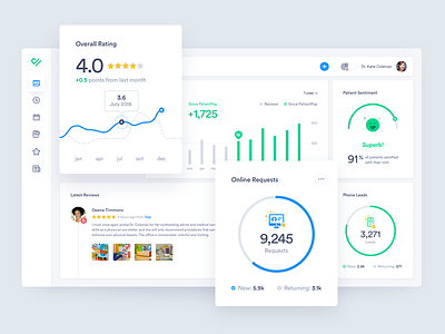
PatientPop Medical Professional Dashboard, Patient Engagement
Typography is essential to any design project, especially in app design. In this dashboard, there are many data elements and key information condensed on a single screen. I’m working to make this as simple and easy to understand for often non-technical users—doctors and medical professionals. The graphs are aimed to be lightweight & clean and the I drew some icons that hopefully add a bit of delight and enhance the experience.
I have two font options in the attachments. The first is Circular, which is starting to become the designer’s salt and pepper—it tends to go well with everything and might be becoming a bit overused. The second is a font that’s little more under the radar called Norms. It’s a little stronger and bolder with some sexy numbers.
I'd love to hear your thoughts on the design and if you have a preference on the font choice.


