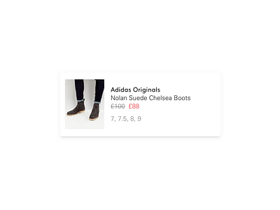
eCommerce product card
Just something wip that didnt make the cut — a simple product tile.
I wanted to focus on the rules around typography — it's very easy to add layer upon layer of noise to promote your product, a discount, what sizes are in stock; applying colours, increasing text size, font weight, and using icons... and before you know it everything is screaming at you and nothing cuts through.
Start with a solid typographic foundation, it's becomes easy to keep the design clean and elegant while higlighting offers and promotions.
Here we use two typefaces, and the same text size, weight and line height, keeping it harmonious and simple.
More by Chris Allwood View profile
Like
