New Logo
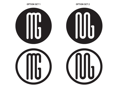
So I am creating a new logo for myself and can't decide between these two sets. I like option set 2 because it feels free but the 'G' doesn't seem obvious enough. I like option 1 because it is what it is, but feels a bit too tight and normal.
You should follow me on twitter to see the kind of stuff I post on twitter!
More by David Geere View profile
Like

