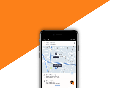
Minor redesign of swiggy ( Figma Freebie )
Was going through swiggy and noticed a couple changes that would make the experience better.
First, the X button on the top left can be changed to a drop icon as it does not close the screen but instead drops it down
Second, On bigger phones the help button on top is a bit of a reach so turning it into a message icon into the middle of the screen makes it more accessible.
Third, The driver info is more in detail where you can know which languages they can speak before calling and if you click on the view more tab you can even get the license plate of the bike to avoid possible confusions.
Thank you very much,
Freebie link - https://www.figma.com/file/NDWn86DcxIsCVho2HUPRdYqp/Swiggy-redesign?node-id=1%3A2
For work queries - kamalkaushi98@gmail.com

