Dribbble Mac App Concept
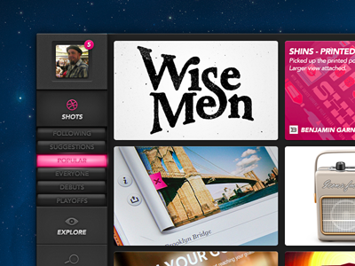
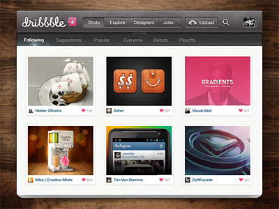
Saw Meng's Dribbble Mac app concept recently and felt inspired to do my own. I wanted to make one that didn't follow the normal nav layout (nav on top) so that allowed me to have a much more slim/sleek look. If you guys like this one enough, I may flesh it out a bit more.
Check the attachment for a view of the entire thing. Thanks to Javier Ocasio for the spacey background image (you can get it here: http://drbl.in/dxDW).
**EDIT: Not sure why the thumbnail came out so saturated. The attachment has the right colors.
More by Justin Lancaster View profile
Like


