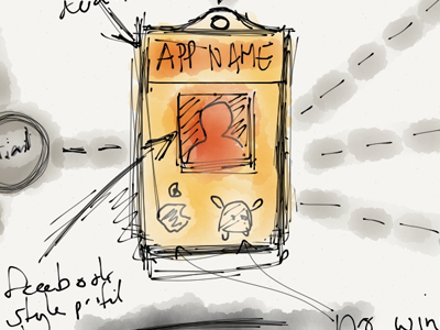
Home Page for a new client
This design was a bad idea, it looked like an info-graphic for the economist and not the right thing for my client. However I thought it would be good to shoot this up just to close it off. I prefer my new direction on this design. I speak more about what I do on twitter so follow me there.
More by David Geere View profile
Like

