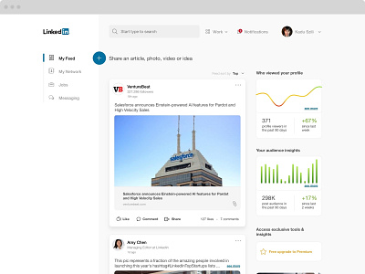
Linkedin redesign concept
Hi everyone, this is something I did just for fun in this Sunday. I tried to solve a Linkedin design problem that, in my opinion, is too much information, too strong strokes in the shapes and information duplicate on the same screen.
Don't forget to check the real size and let me know your thought.
More by Kadu Szili View profile
Like
