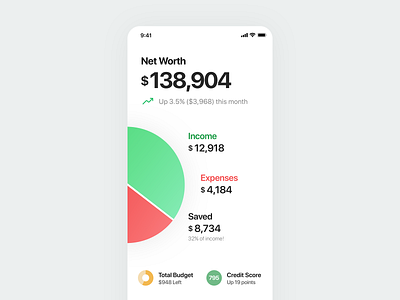
Personal Finance Dashboard
I've been growing tired of the design of Mint and similar finance apps, and wanted to see if I could design a more engaging experience. I strongly dislike how Mint uses a card based system that makes you have to swipe through 6 screens to get a general overview of your financial health. Not to mention the obnoxious ads throughout the app. I wanted to see if I could squeeze all the important personal finance content into one screen, and have it not be overwhelming. Tricky..
I'll be showing off more of this app over the next few weeks as I get further into the design process!
More by Baz Deas View profile
Like

