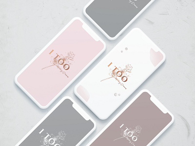
I TOO rebranding and packaging
This project is the rebranding of the I TOO fashion brand. The typography of the brand’s name it’s elegant, and the slogan refer to the young and very feminine girl who consumes the brand. The Cherry Blossom flower symbolizes a time of renewal and the fleeting nature of life. It’s delicate line art refers to the brand’s values and lifestyle - mindfulness and especially sustainability, an element of great importance in all aspects of the company. The logo is minimalist and delicate, but at the same time sophisticated, creating an identification with the brand customer, very feminine, conscious and classy. The colors refer to the environment, but at the same time are feminine and clear.
More by Gabriela Boaventura View profile
Like
