KANA Button / Buttons
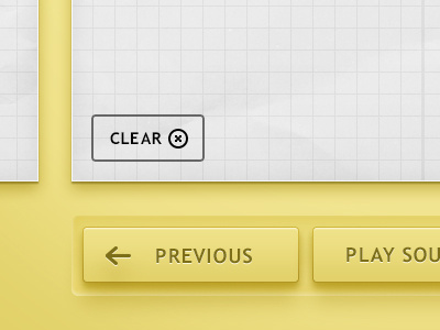
Exploring a possible direction for the aesthetic of the KANA app Im working on. Check the attachment for a full view.
Do you guys have thoughts? How do you feel about the placement/alignment of the text and icons on the face of the buttons at the bottom?
More by Matthew Daniels View profile
Like

