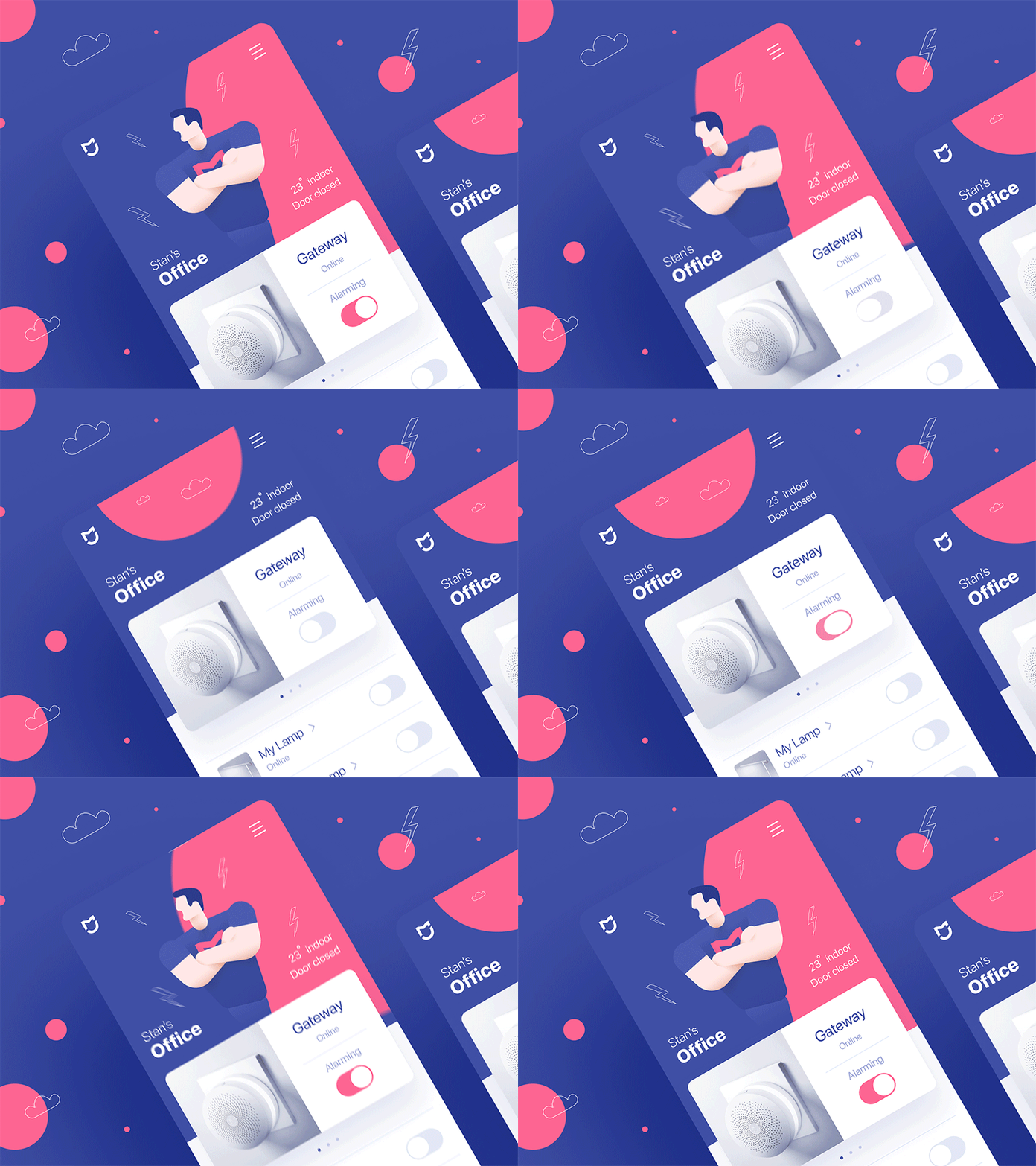
🔑Mi Smart Home - Outside view #1
Hey guys,
Outside view is a new series of redesigns I planning to do on a regular (well, I am not sure but will do my best) basis. My first contestant is Mi Home app. Smart home management app from amazing Chinese brand called Xiaomi which I actively use for last two years. My current experience sometimes feels like I am starving to death trying to find the light switch. Keep in mind that this application is made for quick day to day interactions.
1. Aesthetic
They took all the features and did who knows what.
Well, that's weird, but whatever. That may be the results of Xiaomi actively releasing new products.
2. Attention
So its all about making your home smart on a tight budget. You've got one main Gateway and all other smaller parts connected to it. The Gateway is the general guy in charge there, but it is looking same as not so important guys. And furthermore, Gateway is used to set up an alarm system — one of the default, but hard to access features.
3. Content
Cards with devices are tiny. They've also used 2 column format, which is not working well in a function-heavy app. Blocks and columns are great for photos, but not here. A regular list is much better.
4. Functions
I am also turning my devices on and off each day. Right now it is painful, and soooo long. Imagine you have 4 similar lightbulbs. They will look same in the interface, and you have always read the device name.
In my version, you can take your device photo and assign it as an icon. Its all about seeing things in their natural environment. I've also replaced their custom toggle with default iOS version. You probably know why.
Conclusion
I've tried to make it simpler, cleaner. Divided blocks by roles and focused user attention from primary to secondary features.
P.S.
The colors (I know they are not brand colors) and the animated guy is visually complementing alarm on/off. Just for fun :)
By the way, you can see more works and case studies on our website
Maybe you have an opinion about it?
Thanks!
Stan


