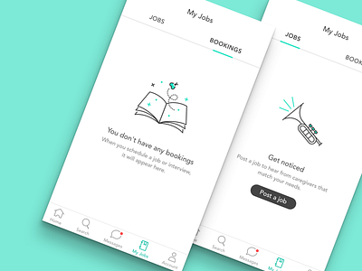
Empty States | Jobs and Bookings
When we introduced a tab nav to the Care.com mobile app, we wanted to add a touch of delight to the empty states top level navigational pages. We added calls to action, when applicable, to give users guidance rather than just leaving them stranded on the empty state. These illustrations are also being animated in AfterEffects and exported for direct use in the apps with the Bodymovin and Lottie plugins
.
.
.
Illustration and Product Design: Elona Jaquez
More by Care Design Studios View profile
Like
