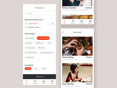
Marketplace search filter
Another shot from the sharing economy platform we're currently developing. This is the filter screen and search result.
Because the platform will be the foundational structure for several different app services, we wanted the design to be clear with just enough personality, yet easy to customise to new markets, users and company needs.
We wanted to give the user content plenty of space, and keep the overall design neutral enough to both fit all the different service categories, and make the users' own brands shine through. The result was a simple greyscale colour palette with a bright orange accent and clear typography.
More by Caroline Natthimmel View profile
Like
