Logo Upgrade for Hotel Company
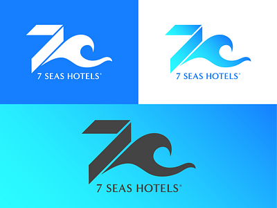
A new logo I created for a recent client who wanted the "7" and "Seas" aspects of their company name to be the focus of the design. I created a contrast between a solid, architectural 7 and a graceful, curvaceous ocean wave - both of which, combined as such, create a faint "H" shape that stands for "hotels" and plays on the viewer's subconscious mind.
