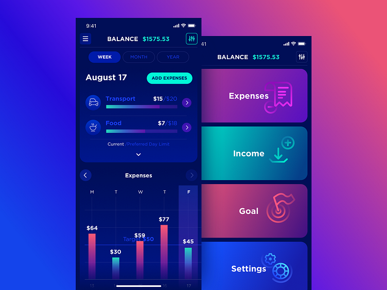
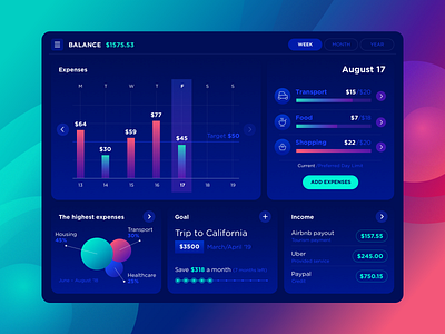
Balance App Iphone X
Hey guys, today I want to present you to the second shot devoted to Balance app concept. This time it’s for iPhone. You can see the new detail—the menu that represents the main chapters. Simple and convenient as it is while the icons help user to understand the meaning right at the first second.
How do you find this solution? Please share your thoughts, I’m excited to know!
Check the full case study on Balance App on Medium.
Meanwhile, I continue to write articles on Medium because I love it sooo much! I even got Top writer in Design achievement and it was like «OMG!». And here is a fresh article Shine Bright Like a UI/UX Designer , take a look!
Have an awesome Thursday everyone!
More by Liudmyla Shevchenko 🇺🇦 View profile
Like

