22Mark
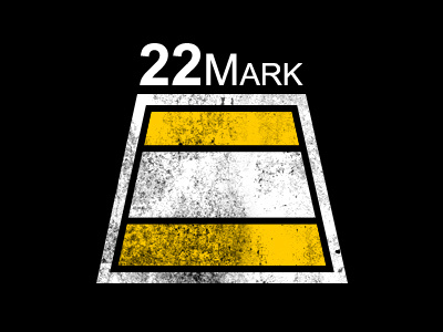
This is logo I am working on for a Rugby brand Im trying to start. The concept is based on the 22 meter mark area on a rugby field which is highlighted in yellow . If you have suggestions on how to improve or make interesting, please let me know. This is one of those things where youre desiging for yourself and you cant seem to get a grip on your concept. Thanks in advanced
More by William Racule View profile
Like
