Lachance - Pt. 2
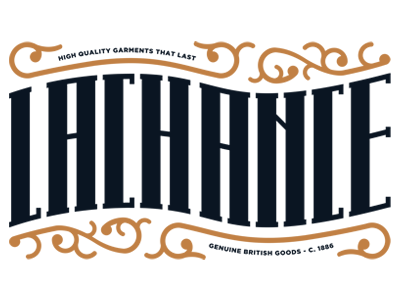
As suggested I shortened up the type a bit to increase legibility, and also revised the choices in color to something that made the type feel stronger and more as the focal point than the ornamentation.
More by Jason Carne View profile
Like


