Letter J Logo - Jump Living
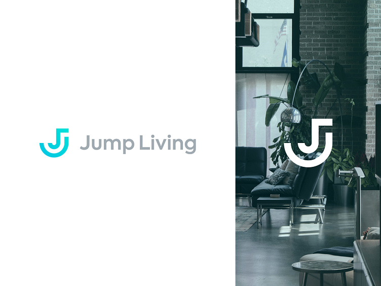
Work in progress ✏️ Jump Living is reinventing the way people lease homes by offering luxury, furnished co-living spaces. Jump Living is elevating a living experience from what people would normally be able to afford to something significantly better at a lower, split cost.
Here is one of the concepts I worked on.
The metaphor:
The logo is constructed from two lines and neither of them makes the "J" alone, however, once united - they make the perfect "J".
Let me know your thoughts. More to come soon!
